Final Project Expo
Come check out the visualization projects that were conducted in CS 448B this quarter! Students in this class spent the last 4 weeks of the quarter developing 34 visualization projects spanning a wide range of topics.
Coffee and refreshments will be provided.
RSVP, Time, Location, and Directions

CS448B final poster presentations will take place on the Stanford campus, Fri. 12/6/2016 4:40pm - 6pm in Lathrop (Library) Room 282.
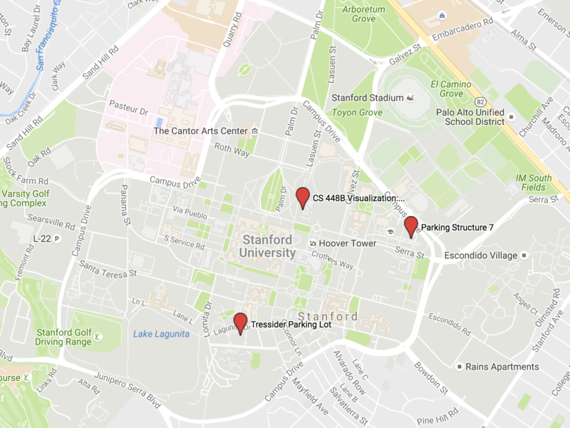
You can find parking either in Parking Structure 7 or Tresidder Parking Lot. Both have pay-by-hour visitor parking. Parking lots are about a 10-15 minute walk to the poster presentation location and tend to be a little busy so please allow a little bit of extra time. Click the map below to get an interactive Google map.
Projects
Interactive Bayesian Network Visualization with D3 for Non-domain Experts
By Jesik Min
In this project, we suggest an implementation of interactive BayesNet visualization tool with D3 framework for people who do not have sufficient domain-knowledge.
Automated Scatter Plot Rendering From Hand-drawn Visualizations for Application in Education
By Jack Reidy
This project introduces concepts in visualization and computer graphics and is designed for children engaged in STEM activities.
Bitcoin and Cryptocurrencies
By Danny Diekroeger
An exploratory data analysis
Ripple of Influence
By Fyza Parviz
Visualization of Wikipedia/DBpedia Influence Data
TimeMultiSearcher
By Amy Chen
Simplifying multi-attribute exploration of time-series data.
Sense of Cents
By Xin Jiang, Gracie Bay Young
Aid Evaluative Judgement on Box Office Revenue by Visualizing Context Information
Interactive Visualization of Hierarchical Circuits
By Ross Daly and Leonard Truong
A browser-based, interactive visualization tool that leverages hierarchy to provide manageable views of large circuit designs.
Visualizing Academic Fields for Noobs
By David Mora
Understanding of how research papers, authors, and applications fit together remains trapped inside the minds of experts — how do we give novices that sort of perspective on the field’s “knowledge landscape”?
Song Visualization Slider
By Jianqing Yang
Visualizing songs on your audio player slider for navigation and browsing
AEGIS: Augmented visualization of Error-control methods on Graphs with Interactive Simulations
By Junjie (Jason) Zhu, Qian Zhao
We apply and focus+context to enhance visualization of structured hypotheses in the gene ontology
From distant to close
By Alyssa Vann
I am building a tool that allows readers to analyze texts at different granularities, from looking at metrics over an entire corpus to seeing specific examples of word usage.
Foreign Actors in Hollywood
By Sharon Chen and Da Eun Kim
Analyzing Hollywood’s attempts to appeal to an international audience with foreign actors
Gotta Track ‘Em All
By Mathieu Rolfo, Karen Wang, Na He Jeon
In the style of Pokemon’s radar charts for each Pokemon’s skills, our visualization displays a theoretical probability distribution of tracks within the CS major for a given class.
Interactive Visualization of Speaker Airtimes in Classrooms
By Berk Coker
A visualization that shows who is speaking when in a classroom (teacher vs. student), and other metrics about the dynamics in the classroom.
WWW Route Visualization
By Noam Habot, Bronson Duran, Robert Fearon
Our visualization first collects packet traffic from the client’s computer and then displays (and allows playback controls of) the geographic routes, along with their delays, that these packets travel until they reach their destination.
D3 Code Genealogy
By Cristian Lara
Tracking shared code through open source projects
League of Legends: visualizing kills, deaths, and assists
By Hope Casey-Allen
A tool that visualizes a player’s takedowns and deaths across their games, allowing them to find hidden patterns in their play
Delish
By Janna Huang, Heather Kramer
We present a new way of accessing food recipes online, letting users quickly reference the overview of a recipe, as well as an interactive way to keep track of current steps that they’re on.
Where to Eat? Interactively Visualizing Yelp
By Kali Cornn
Interactive visualization of Yelp data to make it easier to compare different businesses.
Visualizing the 2017 Sexual Allegations
By Basel Al-Sharaf and Trina Sarkar
After the New York Times published an exposé on decades-long pattern of sexual harassment by film producer Harvey Weinstein, several other titans of industry, ranging from entertainment to Silicon Valley to Capitol Hill, have been accused of inappropriate sexual behavior. In this project, we explore the data surrounding these allegations as well as the awards/accolades these powerful figures have received to probe American society’s complacency in rewarding perpetrators of sexual harassment.
Combating the Opioid Epidemic with Naloxone
By Megan Wilson
My project explores the accessibility of naloxone, a drug used to reverse the effects of opioid overdose.
Whence bar charts?
By Soltan Malekghassemi
Choosing the right representation can change how implementing a visualization is attacked, from bottom-up to top-down.
The Effectiveness of Visualization Techniques on Mobile Devices for Time Dependent Data
By Albert Feng, Pakapark Bhumiwat
We explore how the screen size constraints of mobile devices affect the accuracy and efficiency at which data is interpreted when using different visualization techniques and visualization types.
Interactively Visualizing NFL Play-by-Play Data
By Josh Morris
A visualization tool that displays historical NFL play-by-play data based on different game scenarios.
Ranked-Data Ribbon Visualization
By Greg Ramel
My project is a tool allowing individuals to visualize discrete ranked data over time (such as the New York Times Bestseller List) in a customizable “ribbon” format.
Trust the data or the crowd?
By Sophia Pink
Using interactivity to increase trust in data about controversial issues.
Visualizing complex dance formations
By Jay H Patel
We present Formerator, a web app that enabled choreographers to create and remember complex dance formations.
Impact of Data Variation on Efficacy of Cartograms and Choropleth Maps
By Juliette Love
This project is a user study about the impact of the variance of a dataset on whether non-contiguous cartograms or choropleth maps are more effective for viewer comprehension.
Sampling Perceptually with Weber’s Law
By Vighnesh Sachidananda
We introduce an algorithm to sample a dataset for the purpose of visualization inspired by principles from psychology. The method we present samples in a way that aims to preserve the ability to make comparisons between high and low density regions. Results are presented and compared to common procedures including random and stratified sampling.
Aligning Time Series
By Sergio Sardar, Anika Benons
We take multiple time series and align them at their point of highest correlation, allowing users to quickly gauge how closely correlated the time series actually are.
… And more!